


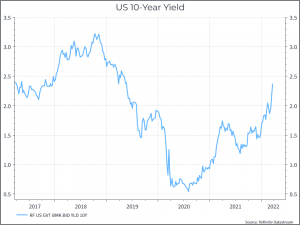
What are we talking about? So far this year, the crisis in Ukraine has dominated the news. In financial markets, many equity markets have suffered, but we’d argue that the real story has been in the bond market. The chart below shows the US 10-year yield, which has risen pretty sharply over the course of the quarter.
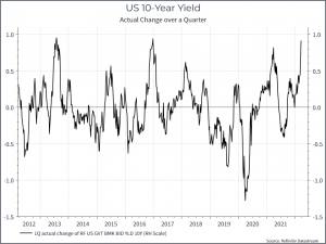
The chart below tries to put that move into context. It looks at the actual quarterly change of the 10-year yield over time. This is the third sharpest rise we’ve seen in a quarter over the past decade.
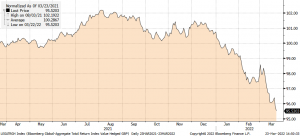
As you would imagine, that has had an impact on fixed income returns. The chart below shows the one-year return for the Bloomberg Global Aggregate index (in sterling) – a widely used global bond market index, down around 5% year-to-date.
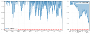
While the next chart shows the sharpest drawdown in US treasuries in the past forty years.
The chart below compares the price (indexed from the start of 2018) of an asset generally regarded as high-risk and high return, in this case the Ark Innovation ETF, and something ostensibly low-risk, in this case the Austrian sovereign 100-year. bond. The comparison is pretty close!
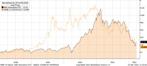
It’s tempting to say we’re over-egging this. The Austrian 100-year bond might not have that much credit risk but, by definition, it carries a lot of duration risk. When yields fall, it does really well, and vice versa. But it’s still an important reminder that the decisions we make in the fixed income part of a multi-asset portfolio can have significant implications for returns. We’re often asked – what’s the point of fixed income with yields so low – and it’s an important question. The charts above remind us that there are still a lot of ways to help our clients with our choices in fixed income.