What are we talking about? We’ve seen a few articles recently on the topic of home-country bias – meaning that investors in a particular market typically have more invested in their own market than in global equities. This has been particularly relevant for the UK, where UK equities have struggled in recent years compared to other global markets. We wanted to dive into this a bit more since we’ve recently reduced our exposure in UK equities in some of our portfolios.
Taking a step back: A couple of points worth mentioning. When we build portfolios, we think globally – so we typically have a lower weight in domestic equities than some other managers in the UK (it’s currently somewhere between 5 and 10% of our overall equity exposure, depending on the portfolio). That’s paid off in recent years, thanks particularly to the strong performance of US equities, but it’s really been a function of our approach. We’re conscious that that might not always be the case – and we’ve had several debates about increasing our UK equity exposure over the past couple of years. So far, we haven’t really acted.
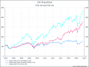
Let’s look at history: The chart below shows the performance of the FTSE 100, FTSE 250 and global equities over the past twenty years.. We can see the underperformance of the FTSE 100 (although dividends have helped a bit) compared to global equities (the middle line). But we also see that the FTSE 250 has done pretty well over the past twenty years, beating global equities. Now the FTSE 100 is the largest part of the UK equity market, but it’s not the only part. This chart suggests that the important thing was to stay away from UK large cap stocks, rather than all UK equities.
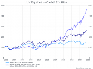
This chart looks at the FTSE 100 compared to the S&P 500 and non-US equities (excluding the UK). Again we see the FTSE underperforming non-US equities, but the gap is smaller, while the S&P 500 dominates. It’s a reminder that one of the key drivers of portfolio performance in recent years has been how much US equity exposure you’ve had.
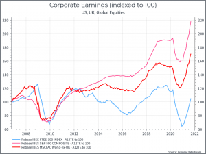
What’s driving performance? Let’s dig into performance a little more. The chart below shows trailing 12-month earnings for the FTSE 100, the S&P 500 and global equities (ex-uk). We can see that the FTSE 100 has simply generated less earnings over the past fifteen years than global equities.
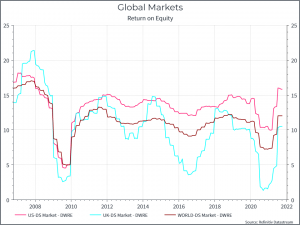
In a similar vein, we can look at corporate profitability – in this case Return on Equity. The chart below uses a different datasource, but it shows a similar picture. UK equity profitability has been lower, and more volatile, than its global peers.
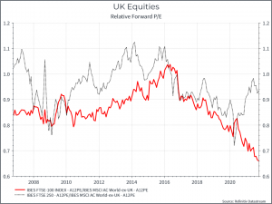
Now let’s turn to valuations. The chart below shows the Price/Earnings ratio of the FTSE 100 and FTSE 250 compared to Global Equities (ex-uk). We see a de-rating of UK equities from mid-2016. Was it Brexit-related? it’s a possibility, but it’s also interesting that the relative valuation of the FTSE 250 has recovered somewhat over the past year or so, perhaps in anticipation of a strong post-Pandemic recovery.
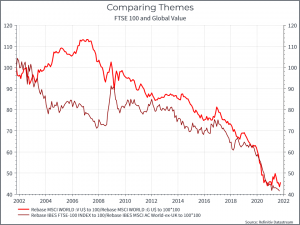
Is this just about the UK? The chart below suggests not. It shows the relative performance of UK equities vs global equities – and it’s a painful sight for domestic investors. The other line shows the relative performance of global value stocks compared to global growth stocks. It too tells a painful story for value investors – as growth stocks have ruled the roost for the past decade or more. The similarities make intuitive sense – the UK equity market has high weightings of banks, resource companies and consumer staples, and rather less in fast-growing tech businesses.
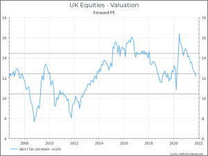
What about the outlook? Without getting into too many details, let’s take a look at a couple of headlines around earnings and valuations. The chart below shows the estimated forward price/earnings ratio for the FTSE 100 over time. We can see that the multiple is slightly below its average over the past fifteen years. We should say that the index would look cheaper if you went further back into history, given higher valuations 15-20 years ago.
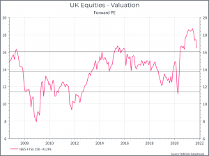
As a comparison, here’s the same chart for the FTSE 250 – still above one-standard deviation higher than the 15-year average.
Let’s turn now to earnings, and earnings expectations. Usually, we can find a set of consensus expectations for the stocks that make up an index. Upgrades and downgrades to those aggregate earnings expectations can be a useful indicator when we think about how those indices might perform. The chart below shows one estimate of earnings revisions for UK equities for this year (certainly not the only one). It shows a contrasting picture. FTSE 100 earnings estimates have been steadily upgraded over the course of the year. FTSE 250 estimates have seen downgrades.
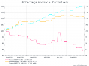
So overall we see a contrast in the UK market – the large caps – unloved and under-performing in recent years – have shown better earnings revisions and a marginally cheaper valuation versus history. The mid-caps – historically stronger performers – look more expensive relative to history and with weakening earnings expectations – perhaps reflecting a bit of a pause in the UK economic recovery. This line of thinking helps to explain our decision to remove our fairly small position in UK mid-caps during the last rebalance. And, on these simple metrics, UK large caps might actually be looking better than they have done for a while.
Where does all this get us on the question of home-country bias? We typically take a global approach to investing in equities. We think investors should take advantage of a broad opportunity set, and the UK equity market can be quite narrow. But we’re also conscious that a home country bias isn’t guaranteed to hurt your portfolio performance. After all, if you were a US equity investor, home-country bias would have been a great strategy for the past decade.


