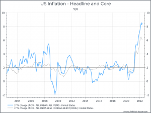
What are we talking about? One of the Asset Allocation Team got a birthday surprise on Friday, courtesy of the US Bureau of Labour Statistics. It wasn’t a good one. US inflation for May came in above expectations (8.6% you versus a Bloomberg consensus of 8.3%). Digging into the details didn’t provide much solace. Take your pick of inflation metrics – Core, Headline, Sticky, Trimmed Mean – it didn’t really matter where you looked, the results didn’t look great.
A few charts: They’re not exactly original at this point, but below are a few inflation charts to illustrate the point.
First, headline and core inflation. Even excluding food and energy, inflation looks elevated.
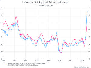
Now for a few adjustments – taking out the most volatile components (trimmed mean) and focusing on potentially “sticky” inflation gives the same result – you need to go back to the 1990s to find comparable growth rates.
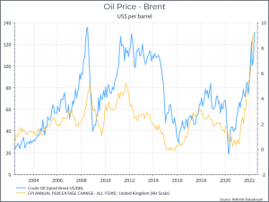
Oil prices are clearly playing an important role – and the chart below illustrates the point.
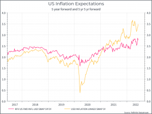
The next chart is interesting. As John Authers at Bloomberg highlighted, in the past you could argue that long-term inflation expectations were still “anchored” and that mattered to the Feds. But the chart below illustrates that that anchor is beginning to move. The chart shows the markets assessment of inflation in five years time (the five year forward) and it’s assessment of where markets think inflation will be ten years from now in five years time (yes, it’s a bit convoluted). On both cases, we can see long-term inflation expectations drifting higher.
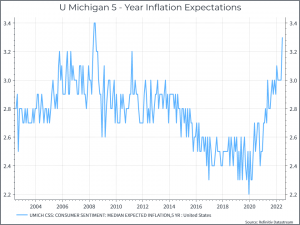
And (again as Authers mentions), consumer expectations on inflation are now aligned with financial markets. The chart below shows a consumer survey on inflation (in 5 years time) by the University of Michigan.
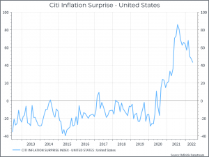
Good news was distinctly thin on the ground. The chart below shows a measure of inflation surprise for the US – basically, to what extent has inflation (and there are lots of inflation reports) been coming in higher or lower than expectations. It shows that inflation continues to beat analyst expectations, but not by quite as much as in the past.
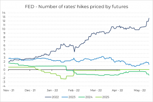
Where does that leave the Central Bank? The chart below shows market expectations for the number of Fed hikes (as of June 13th). Expectations for this year have risen over the past few weeks. The Fed will hike rates again in mid-June. The market had priced in another 50 bps increase prior to this inflation print. After the result, the probability of a 75 bp hike has risen, even if we’d guess that the Fed will stay with only a 50 bps hike.
Along with higher policy rates, we’ve also seen government bond yields rise. The chart below shows the rise in the US 10 year and US 2 year yield.
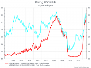
But we can also see that the 10 year- 2 year curve has flattened over the past few weeks. There’s lots of discussion about whether or not an inverted yield curve (ie when the 2 year yields more than the 10 year) signals a recession – we’re not there yet. The chart below suggests that a flattening yield curve has often come before a recession. The problem is that a) it’s not always been the case (see the mid 1990s) and b) the “official” start of a recession can occur some time after the yield curve has finished flattening. In the end, it seems fair to say that the probability of a recession in 2023 is rising.
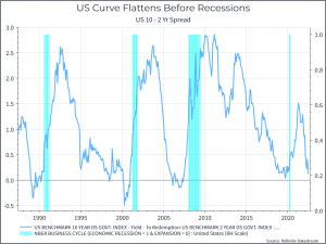
Where does this get us? Another disappointing inflation report has put pressure on both sovereign bonds and more risky assets like equities. The likely combination of tighter monetary policy and slowing demand should raise the probability of a recession and a likely hit to corporate profitability. We continue to wait for the opportunity to increase our equity exposure across portfolios.
