2020 has been anything but normal. The continued spread of Covid-19 has touched just about every area of our lives, from the length of our wedding guestlists to the opening hours of our restaurants. Economically, we’ve experienced the kind of upheaval that only comes around once in a generation. It’s been an eventful year.
Among all the noise, one trend that has come into sharper focus is the disparity between the markets and the economy at large. As countries slide into recession, businesses close down and unemployment figures skyrocket, the prevailing rhetoric has been that markets have been flying. Sharp losses were met by a similarly sharp recovery as the markets operate in what often seems like something of a vacuum. But, as we enter the final quarter of 2020, is this true across the board?
Trans-Atlantic differences highlighted
For a lot of UK investors, it’s common (and perhaps natural) to focus on economic developments close to home. The seemingly inevitable second wave of Covid-19 has put even greater scrutiny on the government than before, with the conversation turning away from immediate health concerns – we understand the virus far more than we did the first time round – and towards long term economics.
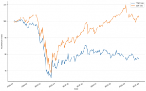
With a potential second lockdown on the way and some sectors still being very much on the ropes, it is understandable that people are concerned about their investment portfolios. They might look to global indexes for a snapshot of the economy’s health and, then, they might see the FTSE 100 struggling.
As you can clearly see below, the FTSE 100 hasn’t had a particularly strong year. The UK’s main stock index has struggled to make back the losses of March and April and has, in truth, lagged behind its peers for a while now.

What’s in the index?
So why, exactly, is the FTSE 100 falling behind the S&P 500 this year? Well, the obvious answer lies in the companies that make up the two indexes. Specifically, it’s worth examining the different sectors that form large parts of the two indexes, from which we can get a better understanding of the disparity in their performances.
In the context of the last six months, technology has played an important part. Perhaps unsurprisingly, the S&P 500 is notably more progressive in its make-up, with roughly 29% of the index made up of technology companies (by market size), compared with the FTSE 100, which has a paltry 1.52% of its companies in the same category. Altogether, the so-called FAAMG stocks (Facebook, Apple, Amazon, Microsoft and Google) make up roughly 25% of the S&P 500.
By contrast, the FTSE 100 consists of roughly 15% energy and raw material companies, a sector that makes up only 5% in the S&P 500. In a world pushed indoors, consumer technology – particularly digital technology – thrives. It is perhaps a simplistic analysis, but the S&P 500’s tech cohort has been tasked with a lot of the heavy lifting in an economy that’s increasingly reliant on it.
A deeper look at sectors
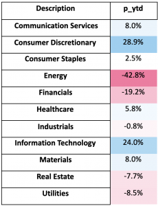
Why, then, do the differences in sector allocation matter as much as they appear to? Well, the easiest way to answer that question lies in the chart below. It details the performances of various different sectors across 2020, up to September 18th. I have chosen the US to further highlight the disparity.

As you can see from the stark differences in the figures, 2020 has seen an enormous disparity in the performances of various sectors. This will, inevitably, lead to various investments vastly outperforming each other.
The spread of Covid-19 has changed the fundamental ways in which society functions. Particularly over the short term, the winners and losers in this brave new world are laid bare. As we mentioned earlier, ‘Tech’ has performed well, but as has ‘Consumer Discretionary’, driven largely by Amazon.
Financials have suffered a lot as a result of falling interest rates and a flattening yield curve, which affects their ability to make money borrowing and lending. Energy stocks have been hammered in line with oil prices. Whilst this was largely in part to a ‘supply side shock’ – i.e. a price war on Oil, the lack of demand that comes with a big fall in economic activity has only made the situation worse.
This is not just relevant for a comparison between the US and the UK. These types of index analysis can go some way to explaining the differentials between various markets, based on who their constituents are.
So, how do we deal with this?
Whenever a disparity like this comes around, two schools of thought tend to emerge. On the one hand, the laggards may be due a resurgence and the smart money could be on their currently diminished value. On the other, those that are soaring are doing so for a reason, so sticking with the leaders and backing their momentum could be a smart bet.
The answer is, as always, more complicated than that. Ultimately, it lies in how you see the situation progressing from here. ‘Value’ investments tend to perform best when you expect an increase in economic growth, for example when you come quickly out of a recession. Whereas, if we expect the recovery to be somewhat muted in the broader economic activity, then you might see the same patterns continue.
There are, also, broader questions in play regarding what the growth will actually look like. This crisis could yet produce some key structural changes, the likes of which will change the face of economic activity in the years to come, which would instigate a shift in the size of various industries.
The key to navigating situations like this is to keep your investment portfolio diversified. Both of the charts we’ve looked at demonstrate that getting your ‘bets’ wrong can cost you dearly. Keeping a sector exposure that is broad means that you can manage the risks that face each individual sector as part of a collective. It’s a strategy for managing your broader volatility that is, now more than ever, a key component of smart investing.


