The end of the year is always a good time to take stock and think about the key issues affecting the markets, both over the last 12 months and looking forward. Scarcely has this been more important than in 2021.
To name just a few of the issues, we’ve seen the vaccine rollout, the semiconductor shortage, expansive monetary policy, fiscal expansion, the Suez Canal blockage, and now a new coronavirus variant. It seems that barely a month has gone by in which markets haven’t been made to consider a new influential factor.
As we look ahead to 2023, we’ve compiled five (well, six) charts that shine some light on the key issues of the last 12 months.
Before we get started, let’s say that the biggest financial decision you can make is to start investing. If you don’t already hold an investment portfolio and are interesting in what one could do for your long term finances, click the link below to get started.
Get started todayInflation proves to be not-so-transitory
When inflation began to pick up earlier in 2021, Central Bankers were keen to stress that it would be transitory. This is to say that the factors affecting inflation statistics – supply bottlenecks, depressed 2020 figures, etc. – would pass in time and normality would resume.
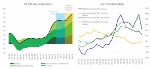
As you can see from the chart on the left, that has patently not been the case. Some of the issues affecting prices have lingered, while others have had knock on effects that are driving prices up. Government support for businesses during the pandemic is one example; this has largely been removed and the cost is being passed onto consumers.
Also relevant are the demand for gas and oil, the ongoing shortage of semi-conductors and, particularly in the UK, a lack of workers able to fill trucking or hospitality roles. The cost of living in the UK rose 5.1% in the 12 months to November, and it will be interesting to see how policymakers and Central Bankers work to get it under control.
Expectations on monetary policy have shifted
Sticking with the theme of inflation for a moment, the next graph charts the sentiment around potential rate hikes. From positive economic growth, to transitory inflation, to not so transitory inflation, you can see how the different periods of 2021 have affected the expectations for rate hikes.
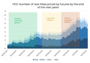
The development of a more inflation-driven narrative has, it would seem, made rate hikes far more likely between 2022 and 2025. Markets predicted fewer than two hikes by 2025 during the period of positive economic growth at the beginning of the year. Now, with inflation seemingly here to stay for a while, we could see around seven hikes by 2025.
A look at equity performance in 2021
For most investors, equity performance is an important metric. You could say that, on the whole, 2021 has been an excellent year for equity returns. The second half of the year has seen a little more volatility than the first half – thanks largely to the Omicron variant causing uncertainty – but the likes of the US, Europe and Japan have seen strong growth.
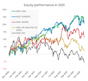
As you can see, the situation is a little different for emerging markets and the APAC region. EM recorded negative performance in 2021, with the problems really starting in early summertime. The primary reason for this dip in performance is China – the two principle issues affecting the largest economy of the bunch are the resurgence of Covid-19 and some disappointing economic growth figures. The Chinese government’s crackdown on large techn companies has also had an impact on the country’s ability to perform economically.
Vaccines rolled out globally, but unevenly
The defining story of 2021 has been the global vaccine rollout. With a number of vaccines seeing approval towards the end of 2020, this year has been the stage for one of the largest global health initiatives ever undertaken.
The difficulty comes when we examine vaccine inequality. It’s no surprise that countries in Europe and North America were quick to vaccinate significant portions of their populations, having bought up millions of doses early on. The chart below demonstrates the gulf in vaccination rates between countries based on their median income.
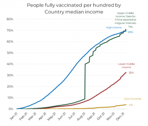
Higher GDP has, generally, meant higher vaccination rates. Supply is a major issue, but the reality is a lot more complex. Having a well-oiled machine in place to administer the jabs, stocked with well-trained medical professionals, is another major factor, along with the ability to clearly and easily propagate healthcare messaging.
Fiscal and monetary expansion continues
This year has been defined by the revival of fiscal policy, with government debt increasing relative to GDP despite strong growth. Governments have continued to take drastic and sweeping stimulus measures, after the unprecedented actions taken in 2020.
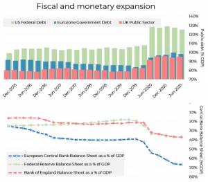
For now, it’s Central Banks that have paid for it. As we can see, the expansion of Central Bank balance sheets has run parallel with the increases in public debt. This, of course, creates an imbalance, for which Central Bankers are forced to invert monetary policy.
From one side, we can say that high levels of public debt creates an implicit incentive for more expansionary monetary policy (inflation could make it easier for governments to pay back their debts). On the other, we can also expect that some of the bill will eventually fall on the heads of ordinary people and businesses through increased taxes.


