What are we talking about? It’s pretty clear that global supply chains have been under pressure over the past eighteen months. If you live in the UK, you might have experienced “electric car smugness” (either you didn’t have to queue for petrol, or you had to listen to someone else who didn’t have to queue for petrol). There are a long list of reasons to explain what’s been happening – plant closures in Asia, increased demand for exercise equipment in the US and the UK, lack of labour in the agriculture sector etc etc. All have their merits and it looks like the disruption will be with us for a little while longer. In any event, we were looking for easy ways to understand (and maybe explain) the problem.
A demand shock: In the end, it looks like US retail sales is a decent way to show the shock that the global supply chain has experienced. The chart below shows total US retail sales over the past thirty years. At first glance, it’s remarkable how consistent the trend has been. Until the end of 2019, there’s been a relentless march towards higher consumption of goods, marred only by a brief downturn in 2009. But COVID brought a significant shock – first in terms of plummeting demand and then, remarkably swiftly, towards a higher level of retail sales – a step change that, so far, hasn’t really normalised back towards the long-term trend. We think about March – April 2020 as being a demand shock, but maybe the true demand shock – at least in terms of higher retail sales – is the one we’re currently experiencing in the US.
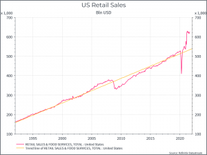
So we’re basically arguing that we’ve seen a pretty big positive demand surprise – driven by income support (in some cases income increases), people switching from consuming services (restaurants, travel etc) to consuming goods and so on. Inevitably that’s far from the entire story – we’ve seen significant disruptions to production for a range of reasons, but the retail sales chart does show how much of an increase we’ve seen and how far above trend retail sales in the US still are. In a global supply chain optimised for efficiency, that alone might have been enough to cause disruption.
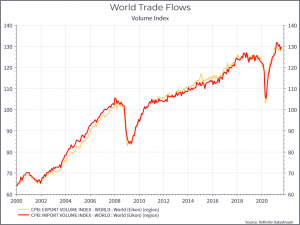
A few other charts: Since we can’t just show one chart on this topic, here are a few more to illustrate the point. The chart below shows global trade volumes over time, again a steady increase punctuated by a couple of big drops. Current trade volumes are already back more or less to pre-pandemic trends – reflecting the demand for goods across the globe.
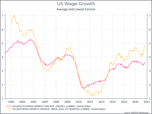
Going back to the US consumer, the chart below shows wage growth (for the average worker and for the lowest paid). We see steady wage growth (albeit now with higher inflation) for the average and a period of faster growth for the lowest paid. Given the shortage of workers in the US, particularly at lower end of the spectrum, and the wage increases employers like Amazon have put through, you might expect this to continue for a while longer.
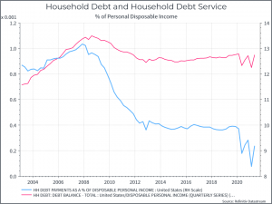
Finally a couple of charts on the state of US households. The first chart shows household debt and debt service compared to disposable income. We’d argue it shows a fairly healthy picture, at least in aggregate. Household debt hasn’t really increased during the pandemic – while the cost of servicing that debt (interest expenses) has come down – thanks to lower interest rates. There are still a great many households struggling in the US, but the aggregate picture looks quite solid.
In a similar vein, the chart below shows the proportion of consumer credit card debt that’s delinquent. Again, it suggests, in aggregate, that US households are managing with their finances and have money to spend.
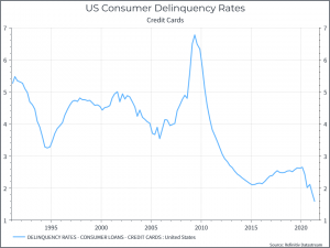
Where does this get us? These charts tell a story of pretty robust demand in the world’s largest economy. And of households that have capacity to continue spending – at least for now. It suggests that retail sales might stay higher for longer – at least compared to the historical trend – and an improved supply chain might take some time to help bring down inflation.


