What are we talking about? Utility prices are the dominant topic in the UK at the moment. We wanted to take a look at the listed UK utility sector to see if there were any useful insights.
What do we see? First, a couple of caveats. We’re looking at aggregate data from Datastream and IBES – and we’re taking it at face value. We aren’t doing analysis on any individual companies or disaggregating between water, electricity, gas etc.
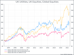
Now for some charts: first, we can see that UK utility stocks have done better in terms of returns than UK equities over the past twenty years, but worse than global equities.
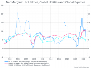
The next chart looks at profitability. We can see that UK utilities (at least based on this data) has on average been more profitable than the global utility sector but its profits are more volatile.
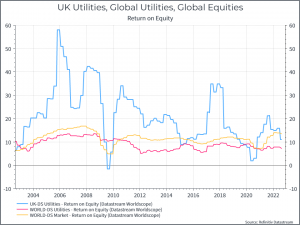
But maybe margins aren’t the right way to look at this. The chart below shows the return on equity for the same three sectors – it’s probably a better metric to capture the true returns to shareholders. We can see that, today, global equities are generating a higher return on equity. But the volatility, and high peaks, in UK utilities is strange. We’d have argued that the sector shouldn’t see such peaks and troughs – it’s notionally a regulated industry.
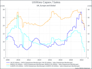
It’s often said that UK utilities haven’t been investing enough – whatever the regulator may claim. The chart below shows capex to sales (a measure of capex intensity) for utilities in the UK, Europe and Globally. We can see that Europe and the UK have historically had a lower capex/sales ratio than their global peers. That might suggest that they’re underspending on investment. They could argue that the rest of the world (notably emerging markets) are spending more on utilities given their stronger economic growth and increasing urbanisation, but the creaking infrastructure in the UK probably tells a different story.
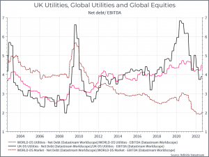
One other suggestion is that UK utilities have too much debt and that’s constraining their operations. The chart below shows Net Debt / EBITDA – a rough measure of leverage – for UK utilities, Global utilities and Global Equities. On this data, UK utilities don’t look particularly levered compared to their global peers, but the Global utility space is looking more indebted than the rest of the equity universe.
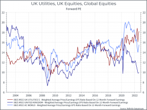
Finally, lets look at expectations. The chart below shows the forward Price/Earnings for Uk utilities, Global equities and global equities. We see that UK utilities valuations have risen, perhaps reflecting expectations for stronger profits in the future.
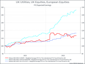
And lastly lets turn to shorter-term expectations. The chart below looks at earnings expectations for next year and how they’ve changed over time. We can see that expected earnings for UK utilities have risen over the past eighteen months, but by far less than the UK market overall. That probably reflects the impact of commodity producers in the UK equity market, but it doesn’t appear that equity analysts are expecting a dramatic increase in UK utility profits.
So where does that all get us? There are a few interesting points. First, it looks like the UK (and European) utility sector could spend more than it has done on capex – compared to its global peers. Second, UK utilities don’t look very indebted compared to their global peers, but maybe the entire sector has too much debt, relative to the rest of the equity universe. Third, in the short-term, analysts aren’t expecting a huge jump in earnings for UK utilities. If that’s correct, then the price increases we’re all seeing might not be flowing straight to shareholders but rather to their suppliers. Fourth, the return on equity data is a bit troubling. It suggests an industry whose return on equity is higher and far more volatile than you’d have expected – or than its European peers. Knowing nothing else, that might prompt you to ask about the regulatory environment. Finally, this is all well and good, but it’s not much consolation if you turn on the tap and nothing comes out.


