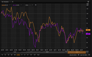
What are we talking about? With all the focus on the ECB last week, we wanted to look at some possible contrasts between China / Emerging Markets and Europe. Looking at their equity performance, there doesn’t seem to be much difference – the chart below shows the YTD performance of a European Equity ETF and an Emerging Market Equity ETF (China is around 30% of an EM equity ETF). Chinese equities have had their challenges over the past few quarters, with a tough policy stance on COVID and tech regulation, and some difficulties in the real estate market – all of which have had an impact, we think, on growth. But as we look at some of the differences between China and Europe today, we think that China could benefit from some tailwinds.
Let’s dig into the detail:
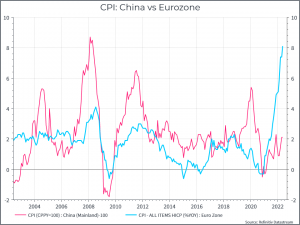
First, let’s take a look at year-on-year inflation. The contrast here is pretty stark – Chinese inflation has proven quite subdued, which European inflation is decidedly not.
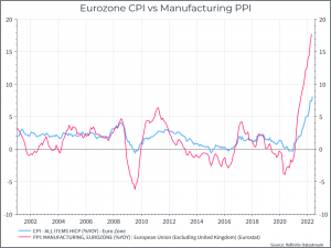
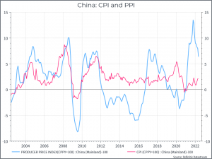
The next two charts show the comparison between CPI and Producer price inflation in Europe and China. In each case, PPI has proven more volatile. In Europe, however, PPI is still rising, and quite quickly – while the rate of producer inflation in China appears to be decelerating.
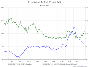
Then let’s look at money supply: The chart below shows broad money growth in Europe and China. We can see that European money growth has been decelerating for some time, even as supply shocks have caused inflation to rise. In China, however, we can see money growth beginning to accelerate – and that could prove a positive for riskier financial assets like equities.
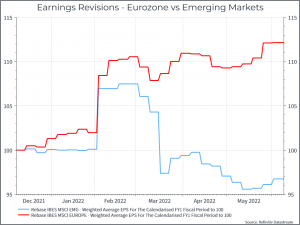
Switching to equities, let’s turn to earnings revisions: As we’ve said before, earnings from companies in Developed Markets have proven surprisingly (to us at least) resilient so far. The chart below shows earnings expectations for European and Emerging Market companies for 2022. European companies have generally seen their expectations remain unchanged, or even rise slightly – while we’ve seen downgrades for EM companies.
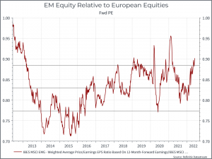
The relative valuation case for EM compared with Europe is less robust, on the surface. The chart below shows the relative forward Price/Earnings ratio of EM equities compared with Europe. It shows EM equities a bit more highly rated with respect to European equities than has been the case over the past ten years. It’s something to be aware of, but if you believed that EM equities were at a relative trough in terms of economic activity, then you might be prepared to accept that.
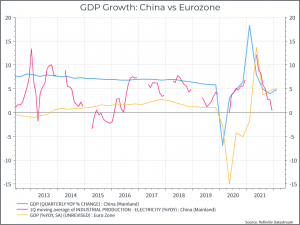
Finally, let’s look at GDP. The chart below shows headline GDP growth for China and the Eurozone. On the surface, not much to choose between them. We would highlight that GDP growth in China might not be the best indicator of economic activity. The (admittedly incomplete) time series for electricity output suggests a lower level of economic activity than that reflected in the official GDP number.
Where does this get us? It’s not neat, clean or definitive, but we think there are some reasons to think that EM equities, driven by China, could provide some diversification over the next few quarters. The inflation data looks better – albeit thanks in part to some aggressive COVID policies and we’d guess that economic activity is at a relatively low ebb. If we do see a looser policy mix in China, for instance regarding COVID, monetary policy and technology regulation, we could see that translate into relatively better equity performance from here.


