What are we talking about? In this piece, we’ll focus on the US. Macro forecasts don’t look great. In general, we see economists downgrading their estimates for growth and upgrading their estimates for inflation. That shouldn’t be great news for households. But so far, the consumer (at least in the US) has held up fairly well – can that continue?
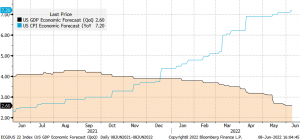
Let’s dig into the detail a bit more: The chart below shows forecasts for US GDP growth and inflation for 2022, showing the downgrades to growth and upgrades to inflation. Typically, you’d rather see the reverse.
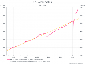
Next, we can see US retail sales (in absolute terms). We saw a sharp jump compared to the historical trend during the pandemic and it hasn’t yet normalised. We’d guess that’s partly due to inflation (these are nominal figures, rather than adjusted for inflation) and partly due to above average household savings.
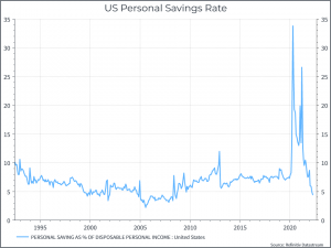
The chart below illustrates the point on household savings. It shows the personal savings rate compared to disposable income. We see a sharp increase during the pandemic, thanks to a combination of government support for income and restrictions on spending. That lasted some quarters and has now begun to normalise – and even fall below the recent pre-pandemic average.
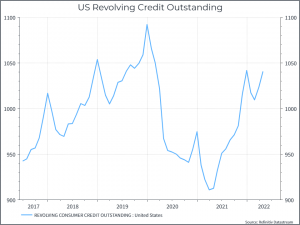
The chart below looks at revolving credit. It shows a similar picture – a sharp drop in total revolving credit during the pandemic – a reflection of the combination of income support and spending restrictions. As the US economy has reopened, we see credit increase.
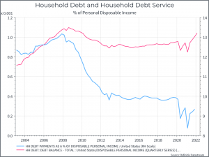
Let’s turn now to the household balance sheet. The chart below shows household debt and debt payments (both as a % of disposable income). Overall household debt to disposable income fell in the years after the Global Financial Crisis and then remained largely flat. In the last couple of quarters, we’ve begun to see that ratio rise a bit. The good news is that low interest rates have meant that the cost of servicing that debt has been very low in recent years – but you’d guess that as policy rates rise, so the cost of debt service will increase as well.
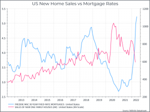
The mortgage market provides a tangential illustration. The chart below shows US new home sales compared to a 30-year mortgage rate. The interest rate has risen sharply over the past few months and we’ve already begun to see a reaction in the housing market.
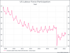
We can also take a look at the labour market. The chart below shows that the participation rate is still below pre-pandemic levels but rising. One interpretation might be that people are gradually burning through their pandemic savings and looking to return to work.
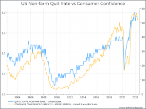
It’s a nice argument but the chart below suggests that consumer confidence on jobs remains quite high, with workers quitting their jobs are a high rate relative to history.
Similarly, surveys from Indeed.com (see chart below) suggest that there hasn’t been yet an increased urgency among job-seekers.
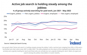
Where does this get us? We think that consumer demand has been quite resilient, despite high inflation, thanks in part to a strong labour market and a relatively high level of pandemic savings. We think that those savings are gradually being run down and we’d expect to see labour force participation drift higher in the coming months. We could also see an impact on private consumption, with metrics like retail sales beginning to move back towards pre-pandemic trends (with some adjustment to inflation). On the margin, this could yet translate into weaker sales for companies exposed to domestic demand, even if equity valuations are now looking cheaper than they have for some time.
